01. Edit your 10 1 scatter plots and trend lines answer key online
Type text, add images, blackout confidential details, add comments, highlights and more.
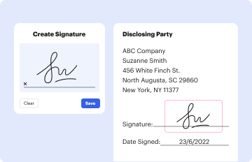
02. Sign it in a few clicks
Draw your signature, type it, upload its image, or use your mobile device as a signature pad.
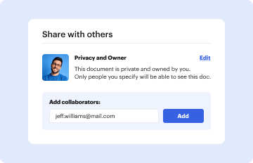
03. Share your form with others
Send scatter plots and trend lines worksheet answers via email, link, or fax. You can also download it, export it or print it out.
How to use or fill out 10 1 scatter plots and trend lines answer key with our platform
Ease of Setup
DocHub User Ratings on G2
Ease of Use
DocHub User Ratings on G2
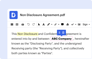
Click ‘Get Form’ to open the 10-1 Scatter Plots and Trend Lines answer key in the editor.
Begin by entering your name, date, and class in the designated fields at the top of the form.
For each problem, carefully read the instructions. Start with Problem 1 by graphing a scatter plot using the provided data on juice drinks sold.
In Problem 2, identify and write down the two variables related to your scatter plot.
Proceed to Problem 3 where you will describe the correlation observed in your scatter plot. Estimate the correlation coefficient, r, based on your findings.
Continue with Problem 4 by discussing potential causation between variables based on ice cream and suntan lotion sales.
For Problems 5a and 5b, create another scatterplot for snowboarders and new snow data. Draw a line of fit and find its equation.
Finally, answer any remaining questions by providing estimates or explanations as required in each section.
Start using our platform today for free to streamline your document editing experience!
Fill out 10 1 scatter plots and trend lines answer key online It's free
10 1 scatter plots and trend lines answer key pdfScatter Plots and Trend Lines Worksheet pdf10 1 scatter plots and trend lines answer key gradeScatter Plots and Trend Lines Worksheet answersLine of best fit Worksheet with answers PDFhow do scatter plots show trends in data?Trend line on scatter plot Excelan algorithm used to find a precise line of fit for a set of data.
Security and compliance
At DocHub, your data security is our priority. We follow HIPAA, SOC2, GDPR, and other standards, so you can work on your documents with confidence.
Draw a scatter plot and describe what relationship exists within the data. 3. Make a scatter plot of the data in the table. Draw a line of best fit. What is theRead more
Feb 28, 2002 Graph the data and store the graph to a pic variable. 1. Select Menu, and then select Charts Line. 2. Enter A2:A8 at the XRange prompt.Read more
Cookie consent notice
This site uses cookies to enhance site navigation and personalize your experience.
By using this site you agree to our use of cookies as described in our Privacy Notice.
You can modify your selections by visiting our Cookie and Advertising Notice.