Rates Volume and Revenue Template FY 07 - FY 09 - partners 2025

Get Form
Rates Volume and Revenue Template FY 07 - FY 09 - partners Preview on Page 1

Here's how it works

01. Edit your form online
Type text, add images, blackout confidential details, add comments, highlights and more.
02. Sign it in a few clicks
Draw your signature, type it, upload its image, or use your mobile device as a signature pad.
03. Share your form with others
Send it via email, link, or fax. You can also download it, export it or print it out.

How to use or fill out Rates Volume and Revenue Template FY 07 - FY 09 - partners

Form edit decoration
9.5
Ease of Setup
DocHub User Ratings on G2
9.0
Ease of Use
DocHub User Ratings on G2
  1. Click ‘Get Form’ to open the Rates Volume and Revenue Template in our editor.
  2. Begin by filling in the 'Core Name' and 'Core Director' fields at the top of the template. This information is essential for identifying the responsible parties.
  3. In the 'Service Description' section, list each service (A, B, C, etc.) that your organization provides. Ensure accuracy as this will impact revenue calculations.
  4. Next, input the rates for FY 2007, FY 2008, and FY 2009 in their respective columns. These figures are crucial for calculating projected revenues.
  5. For each month under 'Projected Volume', enter the expected volume of services rendered. This data will help forecast revenue accurately.
  6. Finally, review all entries for accuracy before saving or exporting your completed template. Utilize our platform's features to sign or share your document seamlessly.

Start using our platform today to streamline your document editing and form completion process for free!

be ready to get more

Complete this form in 5 minutes or less

Get form

Got questions?

We have answers to the most popular questions from our customers. If you can't find an answer to your question, please contact us.
Contact us

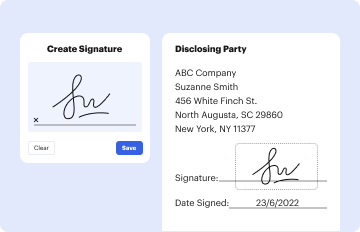
Yes, a typed name is accepted as a valid electronic signature when you add it to your form using a compliant solution like DocHub. Simply add your Rates Volume and Revenue Template FY 07 - FY 09 - partners to our editor, click Sign in the top tool pane → Create your signature → Type your name in the appropriate tab, and choose how it will appear on your document.

If you choose analog ways of completing your Rates Volume and Revenue Template FY 07 - FY 09 - partners, you can easily download your file for printing. Search DocHub’s Forms & Templates catalog to find the exact file template you require and open it for editing or download it on your device in the format of your choice. It is possible to complete your form electronically and place your handwritten signature on it after printing or eSign your file with DocHub.

$5.1 trillion in tax revenue.
A Stacked Column Chart is typically the best Excel chart to display profit and loss. It allows you to visualize revenue and expenses, showing the net profit or loss as the columns height.
Probably the most common visualization of an income statement is a waterfall diagram. Its structure is similar to the income statement in table form: The very top bar shows revenue. Subsequently, one bar represents one line of the table -- showing us how costs slowly eat up revenue.

People also ask

Construct a chart with output (units) on the horizontal (X) axis, and costs and revenue on the vertical (Y) axis. Onto this, plot a horizontal fixed costs line - it is horizontal because fixed costs dont change with output. Then plot a line to represent variable cost starting at the same point as the fixed costs line.
Plot your ARR data points on the Y-axis (vertical) with timemonths, quarters, or yearson the X-axis (horizontal). This simple ARR graph reveals revenue growth trends at a glance. Bar charts are also useful for comparing ARR across different periods or segments of your business.
The Revenue vs. Cost chart is a bar chart that provides a graphical view of the recognized revenues and the corresponding cost of sales. Represents the Cost of Sales for the contract.
What is the best graph to show money? Bar charts are ideal for showing money amounts, such as revenue, expenses, or profits, across different categories. They provide a clear comparison and are easy to read.

Related links