
Start using our platform today for free and streamline your document editing experience!
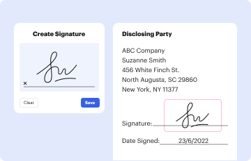
Electronic document signing demands a software solution that works in compliance with data protection and eSignature standards. DocHub is a perfect tool for that, because it meets all the previously mentioned requirements. Whatever method you like to sign your bell curve template word in DocHub, your electronic signature will be legally binding and court-admissible.
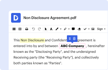
Apart from an extensive toolset for editing PDFs on mobile phones, DocHub enables you to sign your free editable bell curve template along the way. Open our editor in your browser, make changes using DocHub’s toolset, and finish your editing by eSigning the finished form.
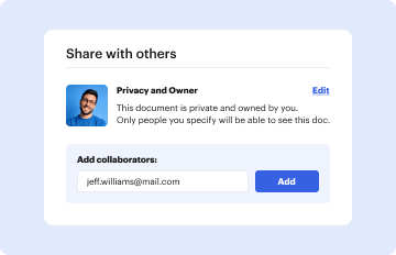
At DocHub, your data security is our priority. We follow HIPAA, SOC2, GDPR, and other standards, so you can work on your documents with confidence.
Learn more