
Start using our platform today to streamline your document editing and enhance your workflow!
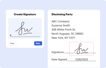
Most eSignature solutions require users to have a paid subscription. With DocHub, there are two ways for you to add an electronic signature to your scatter data sheet template free of charge:
The second option, however, has limitations on the number of signatures, sign requests, emails, and forms for editing available per month. You can check for full information here.
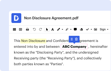
You can find and edit your scatter data sheet template online by using DocHub. Its simple yet feature-rich design allows you to start effective work right after you sign up your account. Create your account and add your file, then our user interface will guide you via our stress-free form completion experience.
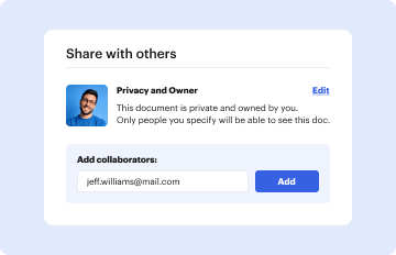
At DocHub, your data security is our priority. We follow HIPAA, SOC2, GDPR, and other standards, so you can work on your documents with confidence.
Learn more