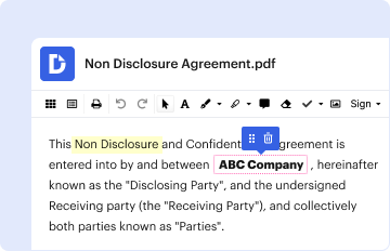
Type text, add images, blackout confidential details, add comments, highlights and more.
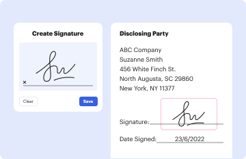
02. Sign it in a few clicks
Draw your signature, type it, upload its image, or use your mobile device as a signature pad.
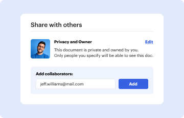
03. Share your form with others
Send home comparison chart via email, link, or fax. You can also download it, export it or print it out.
How to use or fill out home comparison chart with our platform
Ease of Setup
DocHub User Ratings on G2
Ease of Use
DocHub User Ratings on G2
Click ‘Get Form’ to open the home comparison chart in the editor.
Begin by filling in the 'Features' section for each house. Enter details such as Address, Price, Number of Bedrooms and Baths, Square Feet, and Garage spaces.
Next, assess additional features like Family Room, Air Conditioning, Formal Dining Room, Pool, and Spa/Jacuzzi for each property.
Continue to the 'Home Comparison Chart (Continued)' section. Here, evaluate Lot Size, Landscaping, Kitchen quality, Floor Plan layout, Storage Space availability, Condition of the house, Extras you may want to specify, Curb Appeal, and Commute Time.
In the 'Neighborhood Features' section, compare Crime Rate and Quality of Schools for each house. Also note Proximity to essential services like Schools, Hospitals, Shops, Transportation options, and Cultural Activities.
Finally, provide your Overall Opinion for each house based on your assessments throughout the chart.
Start using our platform today to effortlessly compare homes online for free!
Home comparison chart pdfFree home comparison chartCompare houses side by sideHouse Comparison checklistZillow compare homesCompare 2 homesBest way to compare homesCompare house prices in my neighborhood
Security and compliance
At DocHub, your data security is our priority. We follow HIPAA, SOC2, GDPR, and other standards, so you can work on your documents with confidence.
Cookie consent notice
This site uses cookies to enhance site navigation and personalize your experience.
By using this site you agree to our use of cookies as described in our Privacy Notice.
You can modify your selections by visiting our Cookie and Advertising Notice.