01. Edit your 3 column word document template online
Type text, add images, blackout confidential details, add comments, highlights and more.
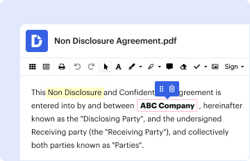
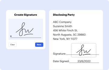
02. Sign it in a few clicks
Draw your signature, type it, upload its image, or use your mobile device as a signature pad.
03. Share your form with others
Send 3 column chart word template via email, link, or fax. You can also download it, export it or print it out.
How to use or fill out 3 column list template with our platform
Ease of Setup
DocHub User Ratings on G2
Ease of Use
DocHub User Ratings on G2
Click ‘Get Form’ to open the 3 column list template in the editor.
Begin by entering your data into the designated fields. Ensure that each category is clearly labeled in the first column, while the corresponding values for each category are filled in the subsequent columns.
Utilize our platform's formatting tools to align your data properly. You can adjust font sizes, colors, and styles to enhance readability and presentation.
If applicable, add any additional notes or comments in a separate section below the columns to provide context or explanations for your data.
Once you have completed filling out the form, review all entries for accuracy before saving or sharing your document.
Start using our platform today to effortlessly create and manage your documents for free!
The 3-Column note-taking method gives you space for your ideas, thoughts, observations Column 1 - main subjects or topics from the text or lecture. Column 2 - details you learned from reading the text, research, or during the lecture. Column 3 - your opinions, observations, thoughts, etc.
How to create a 3 column chart in Word?
How to create a tri-fold leaflet in Word Setting Up Your Document. Start by opening Microsoft Word and creating a new blank document. Creating Columns. To create the three sections of your leaflet, go back to Layout, select Columns, then choose Three. Adding Content. Formatting Your Leaflet.
How to make a 3 column pamphlet in Word?
How to add a two-column bullet list in Word Click on the Page layout tab. To add a second column to your document, you can change the layout format. Choose to create two columns. Inside of the Page layout tab, click on Columns to see your column options for the document. Adjust your margins. Add bullet points.
3 column template word
3 column list template word3 column list template excel3 column list template pdf3 column list template free download3 Column Templates free download3 column list template free3 Column Chart with lines PDFFree Printable 3 Column Chart with lines
Security and compliance
At DocHub, your data security is our priority. We follow HIPAA, SOC2, GDPR, and other standards, so you can work on your documents with confidence.
3-COLUMN THOUGHT RECORD. Directions: When you notice your mood getting worse, ask yourself, Whats going through my mind right now? and as soon as possible
Cookie consent notice
This site uses cookies to enhance site navigation and personalize your experience.
By using this site you agree to our use of cookies as described in our Privacy Notice.
You can modify your selections by visiting our Cookie and Advertising Notice.